Basics
Designing a Dashboard Widget
Use Envision components when possible.
When using custom CSS for styling, all colors should use Envision and Dashboard variables. Other colors and hard coded color values should be avoided.
Wrapper
Most dashboard widgets should be placed inside a wrapper element with class env-dashboard-widget. This will set the correct background, borders and more for the widget. The wrapper does not set a padding.
Widget sizes
There are four available sizes for a widget. The developer may decide which size or sizes a widget should support. The selected available sizes will be available as a user setting when the widget is added to a dashboard.
The widgets will be placed in a grid with four columns. Depending on the available screen size and the selected widget size, a widget may use between one and four columns.
A small widget will never use more than one column. An extra large widget will use as many as available. A small widget will not vary much in size, but a large widget may use anything between 250 and 1440 pixels width.
For adapting a widget to different sizes, see Responsive widgets.
Widget size table
| Widget | Columns | Sizes (px) |
|---|---|---|
| Small | 1 | 250–342 |
| Medium | 1–2 | 250–708 |
| Large | 1–3 | 250–1074 |
| Extra Large | 1–4 | 250–1440 |
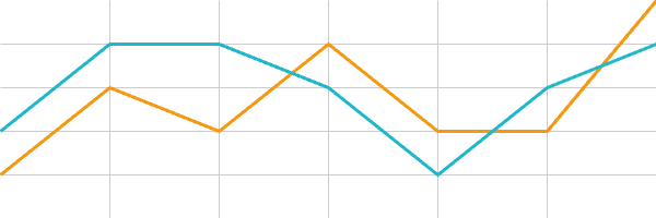
Widget example
Chart widget example heading
— Legend line 1 — Legend line 2
Y axis label
- 1,200
- 1,000
- 800
- 600
- 400
X axis label
- 25 nov
- 26 nov
- 27 nov
- 28 nov
- 29 nov
Simplified code example
This example shows basic usage of CSS classes for headings, labels and more.