Envision for Dashboard Widgets
Introduction
Envision for Dashboard Widgets is an extension to Envision that should be used when creating Sitevision Dashboard Widgets.
The Sitevision dashboard uses a supplied custom Envision theme as a base.
Additional CSS variables, class names and components for building widgets are available as described in this page.
Designing a Dashboard Widget
Use Envision components when possible.
When using custom CSS for styling, all colors should use Envision and Dashboard variables. Other colors and hard coded color values should be avoided.
Wrapper
Most dashboard widgets should be placed inside a wrapper element with class env-dashboard-widget.
This will set the correct background, borders and more for the widget. The wrapper does not set a padding.
<section class="env-dashboard-widget">
   <!-- widget content --->
</section>
Widget sizes
There are four available sizes for a widget. The developer may decide which size or sizes a widget should support. The selected available sizes will be available as a user setting when the widget is added to a dashboard.
The widgets will be placed in a grid with four columns. Depending on the available screen size and the selected widget size, a widget may use between one and four columns.
A small widget will never use more than one column. An extra large widget will use as many as available. A small widget will not vary much in size, but a large widget may use anything between 250 and 1440 pixels width.
Widget size table
| Widget | Columns | Sizes (px) |
|---|---|---|
| Small | 1 | 250–342 |
| Medium | 1–2 | 250–708 |
| Large | 1–3 | 250–1074 |
| Extra Large | 1–4 | 250–1440 |
Responsive widgets
Some widgets may need to use a responsive design to fit different widths. Media queries should not be used since the width of the widget may not be relative to the viewport width. To make adaptions for different widget sizes, use CSS container queries.
The grid column container where the app will be displayed is a containment context named dashboard-widget.
Responsive widget example
<section class="env-dashboard-widget example-responsive-widget">
   <h2 class="env-ui-text-sectionheading">
      Responsive example widget
   </h2>
   <p class="env-ui-text-kpi-number">96%</p>
</section>
@container dashboard-widget (max-width: 449px) {
.example-responsive-widget .env-ui-text-kpi-number {
font-size: var(--env-ui-text-kpi-number-font-size-small);
color: var(--env-dashboard-color-pink-50);
}
}
@container dashboard-widget (min-width: 580px) {
.example-responsive-widget .env-ui-text-kpi-number {
font-size: var(--env-ui-text-kpi-number-font-size-large);
color: var(--env-dashboard-color-light-blue-90);
}
}Typography
The widget theme uses Inter font family which has support for nine different weights 100-900. Other font familes should in most cases not be used.
Thin 100 — The quick brown fox jumps … 123456789
Extra Light 200 — The quick brown fox jumps … 123456789
Light 300 — The quick brown fox jumps … 123456789
Normal 400 — The quick brown fox jumps … 123456789
Medium 500 — The quick brown fox jumps … 123456789
Semi Bold 600 — The quick brown fox jumps … 123456789
Bold 700 — The quick brown fox jumps … 123456789
Extra Bold 800 — The quick brown fox jumps … 123456789
Black 900 — The quick brown fox jumps … 123456789
/* Available weights 100–900 */
.example-fw-100 {
   font-weight: 100;
}
Headings
Widgets should use UI Text for headings.
<p class="env-ui-text-overline">Overline</p>
<h1 class="env-ui-text-heading">Heading</h1>
<h2 class="env-ui-text-sectionheading">Section heading</h2>
<h3 class="env-ui-text-subheading">Subheading</h3>
<p class="env-ui-text-caption">Caption / description</p>
Values and labels
Additional styles only availble in widgets should be used for labels and values in charts and similar.
<p class="env-ui-text-label">Axis label / Label</p>
<p class="env-ui-text-value">Axis value / Legend</p>
Key performance indicators
For displaying key performance indicators you should use the env-ui-text-kpi-number class.
Set different sizes using CSS variables --env-ui-text-kpi-number-font-size-{x}.
<span class="env-ui-text-kpi-number example-kpi-x-small">96%</span>
<span class="env-ui-text-kpi-number example-kpi-small">96%</span>
<span class="env-ui-text-kpi-number">96%</span>
<span class="env-ui-text-kpi-number example-kpi-large">96%</span>
<span class="env-ui-text-kpi-number example-kpi-x-large">96%</span>
.example-kpi-x-small {
font-size: var(--env-ui-text-kpi-number-font-size-x-small);
}
.example-kpi-small {
font-size: var(--env-ui-text-kpi-number-font-size-small);
}
.example-kpi-large {
font-size: var(--env-ui-text-kpi-number-font-size-large);
}
.example-kpi-x-large {
font-size: var(--env-ui-text-kpi-number-font-size-x-large);
}Dynamic font size in widgets
Widgets already has a containment context which makes them dynamic font containers by default. Therefore the dynamic font container is not required.
Here is an overview of how different size widgets will change size at different Dashboard grid sizes. The dashboard grid adapts between 1–4 columns depending on available screen space.
| Widget | 1 column | 2 columns | 3 columns | 4 columns |
|---|---|---|---|---|
| Small | 250–342 | 250–342 | 250–342 | 250–342 |
| Medium | 250–523 | 524–708 | 534–708 | 524–708 |
| Large | 250–523 | 524-812 | 813-1071 | 798–1074 |
| Extra Large | 250–523 | 524-812 | 813-1071 | 1072–1440 |
There are additional widget specific boundaries available for Dynamic fonts. Regular boundaries are documented
on the Dynamic font size page.
Boundaries are set using modifier classes env-dynamic-font--from-{value} and env-dynamic-font--to-{value}.
Additional boundaries for from values: 524, 813, 1072
Additional boundaries for to values: 342, 523, 708, 812, 1071, 1440
Badges
If a value has changed for the better, the worse or is unchanged it may be displayed using one of the widget specific badges availble.
<span class="env-badge env-badge--negative">
   <svg class="env-icon env-icon--xx-small">
      <use
         xlink:href="/sitevision/envision-icons.svg#icon-arrow-fill-down"
      ></use>
   </svg>
   Down 18%
</span>

<span class="env-badge env-badge--unchanged">
   <svg class="env-icon env-icon--xx-small">
      <use
         xlink:href="/sitevision/envision-icons.svg#icon-arrow-fill-right"
      ></use>
   </svg>
   No change
</span>

<span class="env-badge env-badge--positive">
   <svg class="env-icon env-icon--xx-small">
      <use xlink:href="/sitevision/envision-icons.svg#icon-arrow-fill-up"></use>
   </svg>
   Up 18%
</span>
Colors
Widgets should always use the widget color palette variables. In cases where using a variable is not possible, for example in an image, the HEX values from the palette should be used.
Color palette
Make sure color combinations are used that meets the WCAG 2 AA requirements. If unsure about a certain combination, please use a color contrast checker to validate.
-
Black * #202330
-
White #ffffff
= The color will pass WCAG 2 level AA contrast requirements as text on white (widget wrapper) background.
* = The color also passes contrast requirements if used as text on gray-05 (theme body) background.
Color palette CSS variable names
Color variables are named --env-dashboard-color-white, --env-dashboard-color-black and --env-dashboard-color-{colorName}-{variant}.
Available color names: red,
pink,purple,deep-purple,indigo,blue,light-blue,cyan,teal,green,light-green,lime,yellow,orange,brown,gray
Available variants: 05, 20, 50, 90,
Color palette utility classes
Simple decoration of areas may be done using CSS classes. Each palette color has a background and a foreground classname.
Available classnames are env-dashboard-bg-color-{colorName}-{variant} where colorName and variant follow the same
patterns as CSS variable names.
<div
   class="env-dashboard-color-bg-purple-20 env-p-around--medium env-m-bottom--medium"
>
   This is a purple-20 area with default font color.
</div>
<div
   class="env-dashboard-color-bg-purple-50 env-dashboard-color-txt-white env-p-around--medium"
>
   This is a purple-50 area with white font color.
</div>
Widget example
Chart widget example heading
— Legend line 1 — Legend line 2
Y axis label
- 1,200
- 1,000
- 800
- 600
- 400
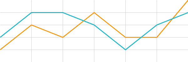
X axis label
- 25 nov
- 26 nov
- 27 nov
- 28 nov
- 29 nov
Simplified code example
This example shows basic usage of CSS classes for headings, labels and more.
<section class="env-dashboard-widget">
   <h2 class="env-ui-text-sectionheading">
      Chart widget example heading
   </h2>
   <p class="env-ui-text-value">
      <span class="env-dashboard-color-txt-orange-50">—</span> Legend line 1
      <span class="env-dashboard-color-txt-cyan-50">—</span> Legend line 2
   </p>
   <h3 class="env-ui-text-label">
      Y axis label
   </h3>
   <ul>
      <li class="env-ui-text-value">1,200</li>
      ...
   </ul>
   <canvas aria-label="Example chart, this text should tell the chart values for accessibility."
           role="img"></canvas>
   <h3 class="env-ui-text-label">
      X axis label
   </h3>
   <ul>
      <li class="env-ui-text-value">25 nov</li>
      ...
   </ul>
</section>
Available Additional CSS variables
Palette Colors
--env-dashboard-color-black--env-dashboard-color-white--env-dashboard-color-red-05--env-dashboard-color-red-20--env-dashboard-color-red-50--env-dashboard-color-red-90--env-dashboard-color-pink-05--env-dashboard-color-pink-20--env-dashboard-color-pink-50--env-dashboard-color-pink-90--env-dashboard-color-purple-05--env-dashboard-color-purple-20--env-dashboard-color-purple-50--env-dashboard-color-purple-90--env-dashboard-color-deep-purple-05--env-dashboard-color-deep-purple-20--env-dashboard-color-deep-purple-50--env-dashboard-color-deep-purple-90--env-dashboard-color-indigo-05--env-dashboard-color-indigo-20--env-dashboard-color-indigo-50--env-dashboard-color-indigo-90--env-dashboard-color-blue-05--env-dashboard-color-blue-20--env-dashboard-color-blue-50--env-dashboard-color-blue-90--env-dashboard-color-light-blue-05--env-dashboard-color-light-blue-20--env-dashboard-color-light-blue-50--env-dashboard-color-light-blue-90--env-dashboard-color-cyan-05--env-dashboard-color-cyan-20--env-dashboard-color-cyan-50--env-dashboard-color-cyan-90--env-dashboard-color-teal-05--env-dashboard-color-teal-20--env-dashboard-color-teal-50--env-dashboard-color-teal-90--env-dashboard-color-green-05--env-dashboard-color-green-20--env-dashboard-color-green-50--env-dashboard-color-green-90--env-dashboard-color-light-green-05--env-dashboard-color-light-green-20--env-dashboard-color-light-green-50--env-dashboard-color-light-green-90--env-dashboard-color-lime-05--env-dashboard-color-lime-20--env-dashboard-color-lime-50--env-dashboard-color-lime-90--env-dashboard-color-yellow-05--env-dashboard-color-yellow-20--env-dashboard-color-yellow-50--env-dashboard-color-yellow-90--env-dashboard-color-orange-05--env-dashboard-color-orange-20--env-dashboard-color-orange-50--env-dashboard-color-orange-90--env-dashboard-color-brown-05--env-dashboard-color-brown-20--env-dashboard-color-brown-50--env-dashboard-color-brown-90--env-dashboard-color-gray-05--env-dashboard-color-gray-20--env-dashboard-color-gray-50--env-dashboard-color-gray-90
Additional UI Texts
--env-ui-text-label-font-family--env-ui-text-label-font-color--env-ui-text-label-font-size--env-ui-text-label-font-weight--env-ui-text-label-text-transform--env-ui-text-label-letter-spacing--env-ui-text-value-font-family--env-ui-text-value-font-color--env-ui-text-value-font-size--env-ui-text-value-font-weight--env-ui-text-value-text-transform--env-ui-text-value-letter-spacing--env-ui-text-kpi-number-font-family--env-ui-text-kpi-number-font-color--env-ui-text-kpi-number-font-size--env-ui-text-kpi-number-font-weight--env-ui-text-kpi-number-text-transform--env-ui-text-kpi-number-letter-spacing--env-ui-text-kpi-number-font-size-x-small--env-ui-text-kpi-number-font-size-small--env-ui-text-kpi-number-font-size-medium--env-ui-text-kpi-number-font-size-large--env-ui-text-kpi-number-font-size-x-large